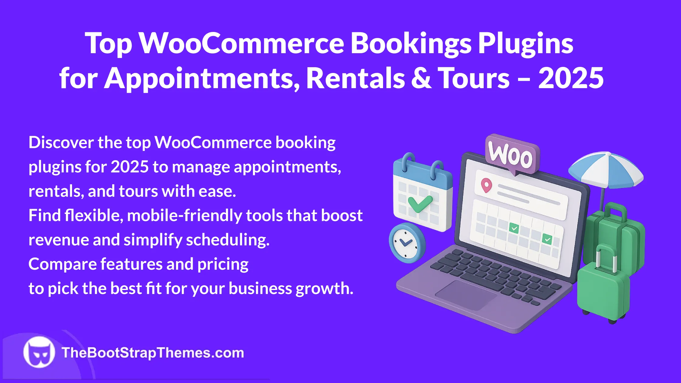
The BootStrap Themes Intro: For this guest post, Nikunj Radadiya from the team at Webibazaar Templates is providing some great insights to help our readers avoid critical design mistakes when first setting up their website. Take it away Nikunj!
When it comes to creating website designs that generate revenue, many businesses struggle a lot. Your website should look attractive but it also needs to make money.
People still make the common mistake to focus on design that looks good instead of focusing on maximizing conversion rates.
Webibazaar Templates provide many eCommerce Web design Themes platform on Best Prestashop Themes, Responsive BigCommerce Themes, Shopify Themes, OpenCart Themes, WooCommerce Themes.
If you would like to increase more traffic, leads, sales, etc on your website then you need to avoid making the same mistakes as your competitors.
Let’s take a look at those mistakes:
No Responsive Design
Responsive design is the most useful feature of a website if you don’t have a responsive Shopify Design, you won’t be able to rank in Google and it harms the customer shopping experience.

Sites that use responsive design, so according to Google’s recommended configuration sites that have served all devices on the same URL serving the same HTML to all devices also using CSS to change how the page is displayed on the devices
Slow Website
If your website is taking more than 3 seconds to load then your website is too slow and your visitors won’t be waiting for your website to load. They will go back to search results and find another site to navigate.

To Optimize Website Loading Speed you need to compress big size images and remove unwanted codes or optimize javascript/CSS to make your site loads fast.
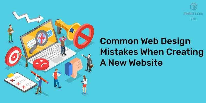
Too Confusing
The confused site features a variety of images, color palettes, themes none of them relate to each other. This occurs for a number of reasons such as if you don’t have a good idea for brand image.
You will easily change your mind when you like too many Design Templates and want to use them all. It also happens when you are trying to bring too many ideas at once and view your site as individual parts rather than integrated.
When you are designing a website choose on theme, logo, and typeface and stick to them across all other aspects of your site.
Terrible CTA
A CTA(call-to-action) is a gateway to your business. It instructs your visitors to do something such as learn more, buy now, get a free ebook, download, etc.
Obviously, it is important that your CTA clearly shows your visitors what they need to do. There should be enough information that your visitors know, what they are gonna get after taking action and what information they need to provide you.
On other hand, there is a line between being annoying and being helpful. Make sure your CTA is short and sweet and tells your visitors exactly what to do. Keep form-filling to minimum information and give them a few minutes on your page before your CTA shows up.
Poor Use of Content
Content is a major part of your website. Content express readers about your business with products or services you offer to visitors. You should be careful about the fonts you choose and how content is shown on the page.
Typeface conveys your brand image in addition to the actual word you write, makes good use of whitespace to bring eyes around your site and creates a large block of text less intimidating.
Incorporating much text into their business website is a huge mistake lots of people make, break some text up where you can, to represent concepts and use visual elements where possible. Always keep your content updated or else visitors will think you are gone out of business.
Irrelevant Images
Images and graphics are an important part of web design. It should be uploaded content related that makes visitors understand your product or service which can be helpful to visitors.
Using irrelevant images can confuse your visitors and they will go out of your site if they don’t find valuable graphics related to your products or services.
Bad Navigation Menu
Navigation issues will be considered as the worst issue and you can lose lots of visitors due to it. We live in a fast world where everyone wants results in the blink of their eye so it’s your duty to serve your website visitors better so you can convert your visitors into your lifetime customers.

So you must always set the navigation menu always on top so your visitors can find anything they want easily in less time and get a better online shopping experience.
Lack of Contact Information
If you are selling products or services you must add your contact info on your page from where visitors can contact you if they have any questions regarding your products or services.
If they don’t find your contact information on your website they won’t purchase any products or services from you so give value to visitors and make them feel like they are shopping from a real store as an offline business.
These are the top common mistakes people make during online store creation. If you made the same mistakes, make sure you implement the above-mentioned points to give your visitors a top-level shopping experience which can help you grow your sales and scale up your conversions.
Webibazaar Templates provides many Web services Such as PSD to Prestashop, PSD to BigCommerce, PSD to Opencart, Website Design Audit Service, SEO Optimization Service, Etc.
Author BIO
Nikunj Radadiya is a Digital Marketer and Content Writer at Webibazaar Templates to provide high-quality content, he is dedicated and passionate about content writing.